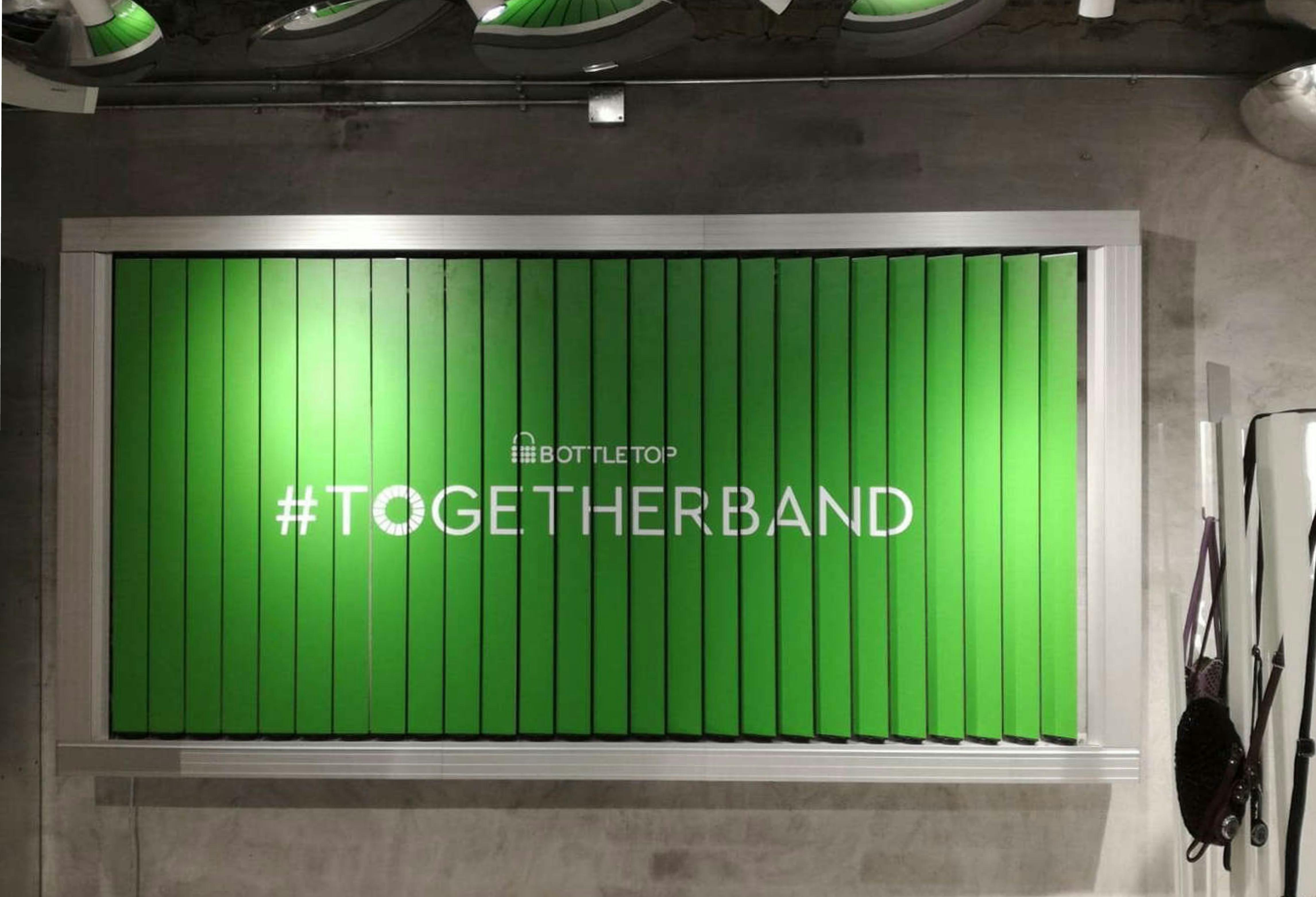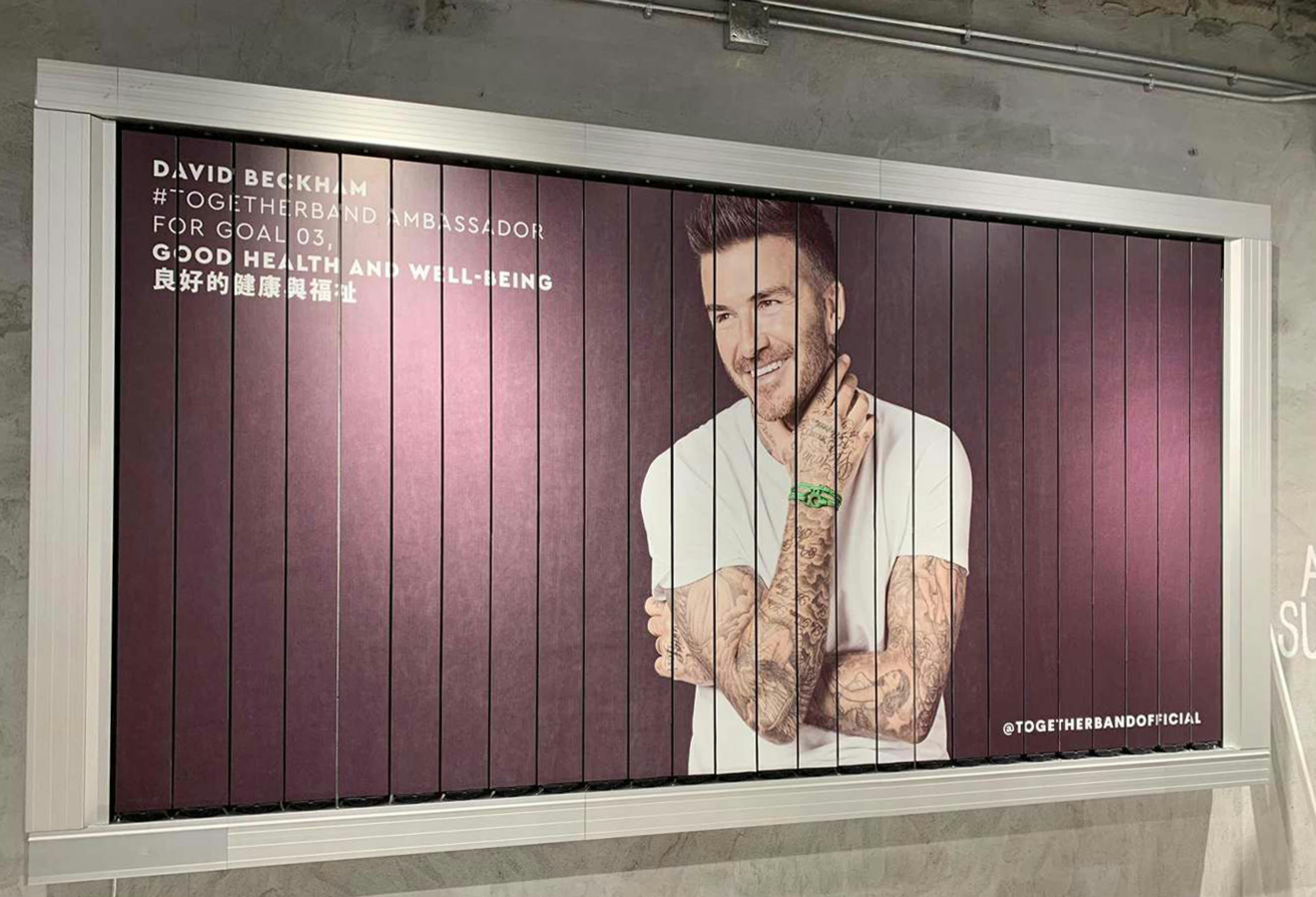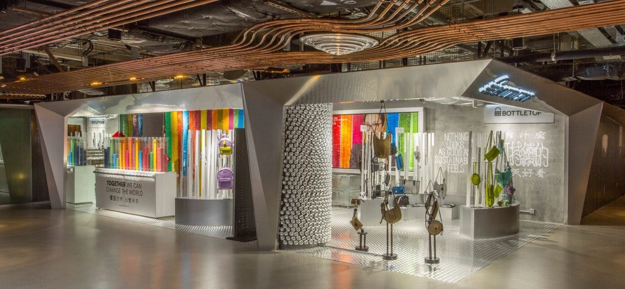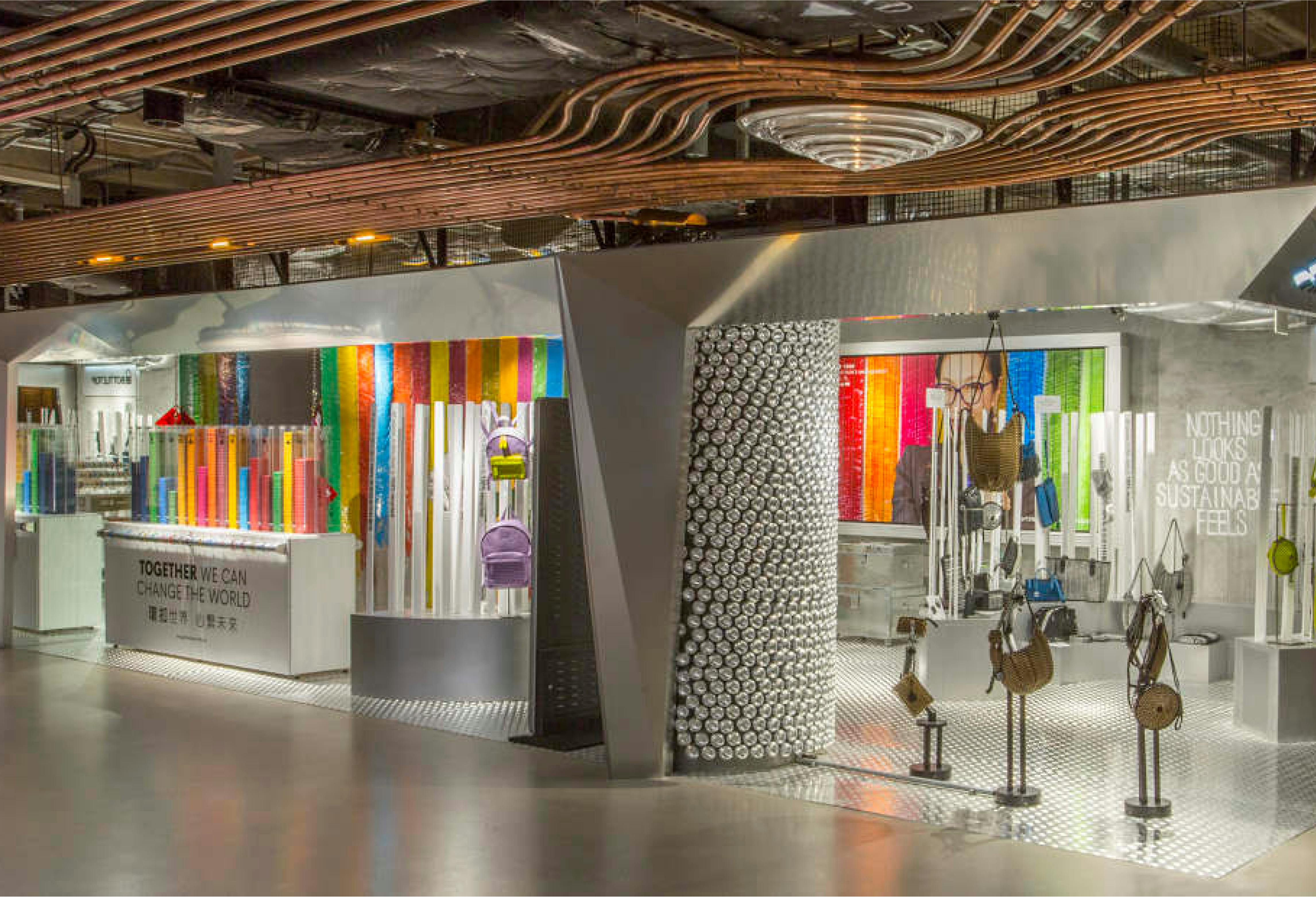
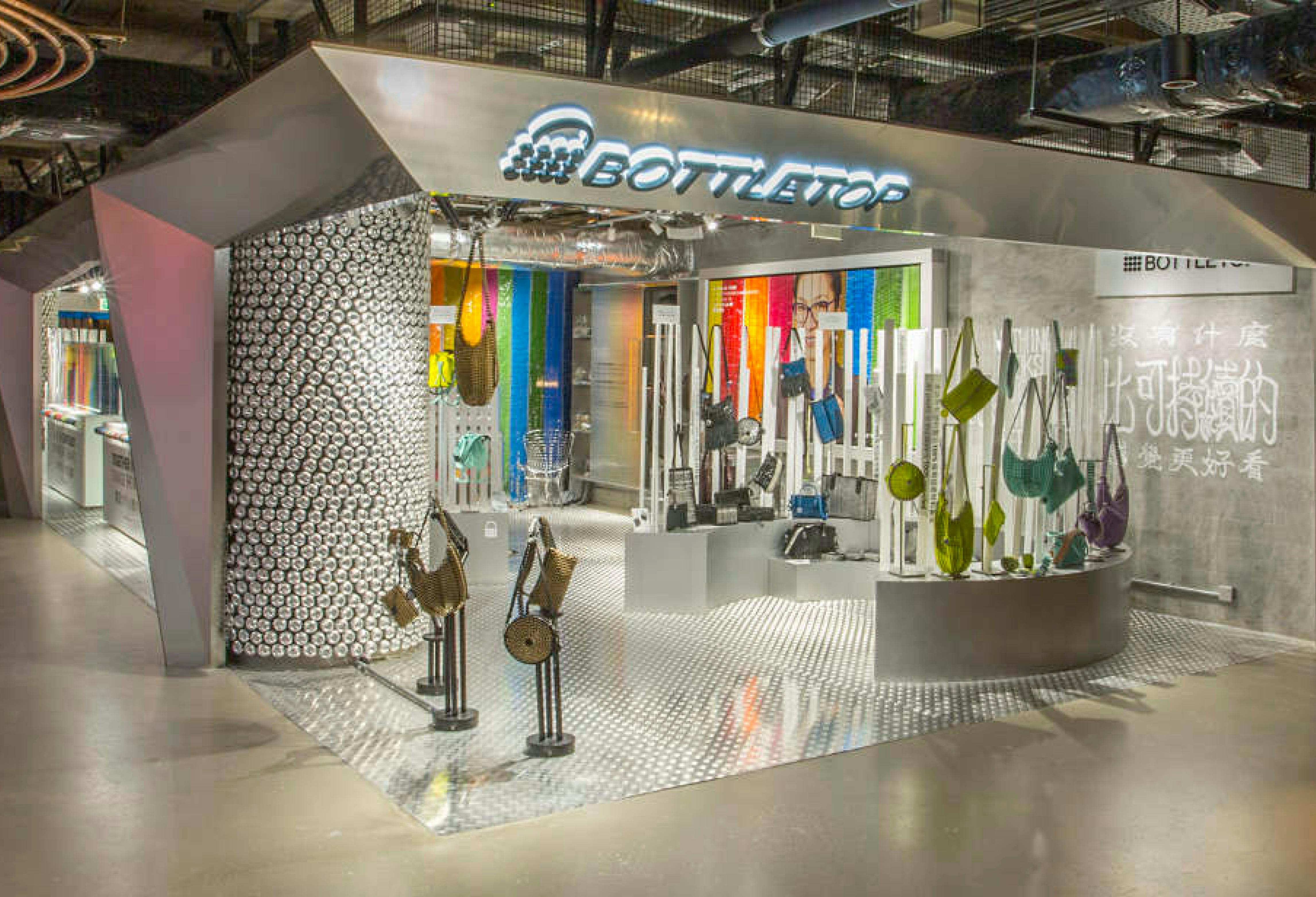
The concept for Bottletop's launch in HK brought a new approach to design and sustainability, introducing local urban materials and recycled acrylic into a luxury setting.
The pop up celebrated craftsmanship, repurposing materials and POS from previous pop ups. Silver & aluminium were the predominant colour palette - a nod to the original structure of the space which delivered a sense of transparency. This coupled with robotic display stands, provided a futuristic feel to the pop up.
Key features were the central can column, the cans a source of Bottletop's ring pull product detail. A Trivision display unit which brought the outside in and a collaboration with BOMS, a local street artist to bring Chinese calligraphy into the store and translate Bottletop's messaging from LDN to HK.
